
 payment page
The Graphical Approach
Economists graphically represent the relationship between product
price and quantity supplied with a supply curve. Typically, supply
curves are upwards sloping, because as price increases, sellers are
more likely to be willing to sell something. For instance, if someone
offered you $10 for one of your favorite shirts, you might not want to
part with it, since it wouldn't be worth it. However, if someone
offered you $500 for that same shirt, you would probably consider it.
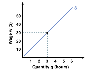
Each individual seller can have their own supply curve, showing how
many products they are willing to sell at any given price, as shown
below. This graph shows what James's supply curve for hours of
tutoring in economics might be:
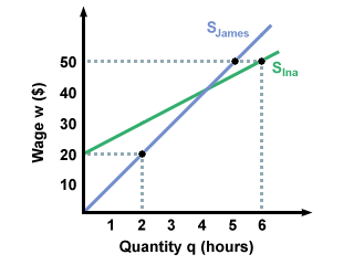
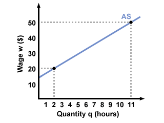
Typically, however, economists don't look at individual supply
curves. Instead, they look at aggregate supply, the combined quantities
supplied by all potential sellers. To do this, you add the quantities
that sellers are willing to sell at different prices, just like we do
to find aggregate demand. For instance, if James and Ina are the
only two tutors in the market for economics tutoring, we would add how
many hours they are willing to tutor at wage w=20 and record
that as aggregate demand for w=20. Then we would add how many
they are willing to tutor at wage w=30 and record that as
aggregate demand for w=30, and so on. Combining the two supply curves in
the first graph results in the aggregate supply curve in the second graph:
There are two ways that supply quantity can change: one is through movements along the same supply curve, the other is through shifts in the supply curve. Let's look at the first one: movements along one supply curve.
Movements along one supply curve follow the same idea as movements along a
single demand curve: nothing is changing except for the price of the good, so
the only thing influencing supply is a change in price. With all else being
equal, we can see how James might change how much he is willing to tutor when
his wage rises or falls in the following graph:
The other way in which supply quantity can change is through actual shifts in the supply curve. If you recall when we studied shifts in demand curves, you will remember that such shifts are caused by outside factors. While demand curves are shifted by changes in income or changes in preferences, supply curves can be affected by changes in profit. Profit is how much a firm actually gains when they make a sale. For instance, if a bookstore buys a used book for $1 and sells it for $5, their profit is $4. Changes in the selling price of the book can change how many books they are willing to sell, and such changes would be represented by sliding up and down the same supply curve, as in the previous example. If the price the bookstore has to pay for the book changes, however, that would cause their supply curve to shift, even if the selling price doesn't change. If they have to pay more for the book, their profits drop, and make them less willing to sell books at prices they were willing to sell at before the change. We can see this below:
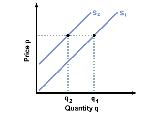
Notice that for any given price, the store will sell fewer books than before, reflecting the higher costs and lower profits they get for each book. Without changing the price at which they sell the book, we have shifted their supply curve and changed their willingness to sell. Thus, changes in profits can shift a firm's supply curve, even if the market price stays constant. We will later learn how to graphically visualize a firm's profits in a given market by using their different costs, sources of income, and the market price and demand.