


Economists use the term utility when referring to the level of happiness or satisfaction someone experiences from consuming goods and services: the more utility, the happier the person. Utility is typically represented on a graph by a series of indifference curves.
Utility and Indifference Curves
Suppose Jim has free access to shirts and hats in any combination. If we set up two axes with shirts on the horizontal axis and hats on the vertical axis, then any combination of shirts and hats is a point on the graph. An indifference curve is a curve that represents all the different combinations of two goods which for Jim generate the same level of utility—that is, the exact same amount of happiness. For instance, if you give Jim a choice between points \(A\) and \(B\) on the curve below, he will be indifferent. One shirt and two hats makes him just as happy as two shirts and one hat.
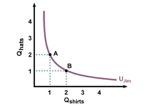
In general, indifference curves bow in towards the origin, rather than being straight lines or outward-bulging curves. The reason is that most people don’t like extremes. Jim, for example, would rather have some shirts and some hats than many hats and no shirts. When he has one shirt and two hats, he is willing to trade one of his hats in return for a second shirt. But he won’t trade the remaining hat for a third shirt. He’ll have to be offered several additional shirts, at least, for the last hat. Similarly, when he has only one shirt, he would have to be offered several hats for it before he would make a trade. On the flip side, if he has nothing but hats, he will readily offer several of them in trade for a single shirt.
Different indifference curves represent different levels of utility, and in general, more is better: the more goods you have, the happier you are. On the graph, we depict this preference for more rather than less as a series of indifference curves that moves farther and farther away from the origin. Thus, because curve \(U_2\) is farther out than curve \(U_1\), and represents a higher level of utility, any point on curve \(U_2\) will be preferable to any point on curve \(U_1\). In the same way, any point on curve \(U_3\) will be preferable to any point on curve \(U_1\) or \(U_2\).
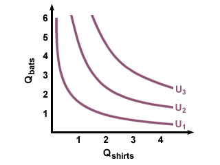
Curves \(U_1\), \(U_2\) and \(U_3\) are shown as sample curves. Between \(U_1\) and \(U_2\) there are many other curves, not shown, each of which is preferred over \(U_1\) and all of which \(U_2\) is preferred over. Similarly, there are curves between \(U_2\) and \(U_3\), as well as curves below \(U_1\) and curves above \(U_3\).