


The point of voluntary buying and selling is to achieve gains from trade. In the chapter on Production Possibilities and Gains from Trade, gains from trade were modeled as an outward movement of each party’s individual production possibilities frontier. How do gains from trade get represented in the two-curves model of market equilibrium?
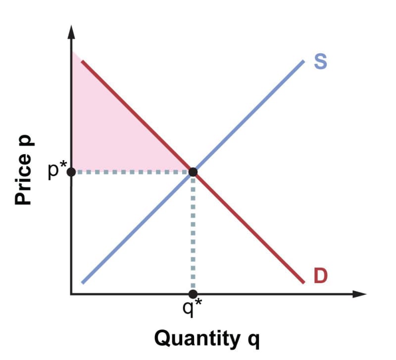
Consider first the buyers. In equilibrium, they’re paying price \(p*\) and buying a total of \(q*\) units. But as the downward-sloping demand curve tells us, most of those units would still have sold if the price had been a little higher. In other words, most buyers are paying less than they were prepared to, from which it follows that they value what they’re getting more than the money they’re paying for it. Therefore, they are experiencing gains from trade. Graphically, the prices consumers would have been willing to pay for the first unit traded, and the second, and the third, and so on, lie along the demand curve, and the price they actually paid is a constant value corresponding to the horizontal line at \(p*\). The area between the demand curve and the horizontal line at \(p*\), highlighted in the figure below, represents the total gain all consumers achieved by paying less than they would have been willing to. We call this the consumer surplus. Algebraically, the consumer surplus in dollars (or other currency units) can be calculated using the formula for the area of a triangle.
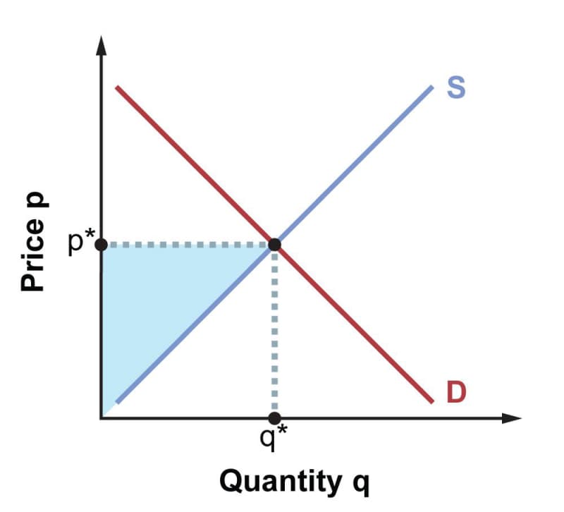
Now consider the sellers. In equilibrium, they’re receiving price \(p*\) and selling a total of \(q*\) units. But per the upward-sloping supply curve, most of those units would still have produced and sold if the price had been a little lower. That is, most sellers are getting more than they would have been willing to accept, and so they value they money they are bringing in more than the goods they are selling. Therefore, they’re experiencing gains from trade. Graphically, the prices producers would have been willing to take for the first unit traded, and the second, and so on, lie along the supply curve, whereas the price they actually received is the constant value p*. The area between the supply curve and the horizontal line at \(p*\), shown as a triangle in the figure below, represents the total gain all sellers realized by receiving more than they would have been willing to accept. This is the producer surplus.
The combined area between the demand and supply curves to the left of the equilibrium point, consumer surplus plus producer surplus, is the total surplus. This is a quantitative measure of the total social benefit, often called the social welfare, achieved through the trade between buyers and sellers.