As the price of something increases, households tend to buy less of it. That makes the quantity demanded a function of the price. Economists use a demand curve to represent this relationship, with price on the vertical axis and quantity on the horizontal axis. (This might be backwards from what you’d expect, but it turns out to be a convenient arrangement.) Each individual buyer can have their own demand curve, showing how many products they are willing to purchase at any given price. The graph below shows what Jim's demand curve for graham crackers might be:
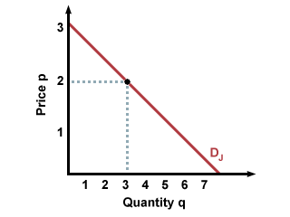
To find out how many boxes of graham crackers Jim will buy for a given price, extend a straight line from the price on the vertical axis across to his demand curve. At the point of intersection, extend a line from the demand curve down to the horizontal axis. The point where that line hits the horizontal axis gives the number of graham cracker boxes Jim will buy. As shown in the graph, Jim will buy 3 boxes when the price is $2 a box.
Typically, economists don't look at individual demand curves, which can vary from person to person. Instead, they look at market demand, which reflects the combined quantities demanded by all potential buyers. To find the market quantity demanded at a given price, add the quantities individual buyers are willing to buy at that price. For instance, suppose Jim and Marvin are the only two buyers in the market for graham crackers, with demand curves \(D_J\) and \(D_M \):
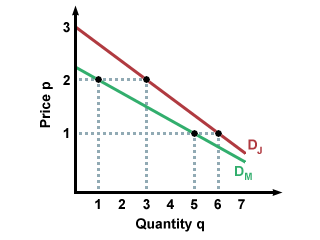
To find the market demand curve. we add the amount Jim is willing to buy at a price of $1 and the amount Marvin is willing to buy at that price, and we record the sum as the market quantity demanded at \(p=1\).
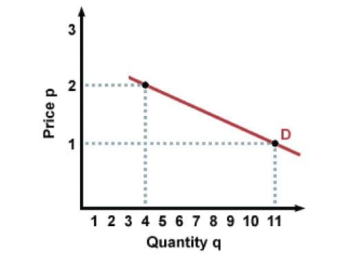
Then we add the quantities they are willing to buy at price \(p=2\) and record that as the quantity demanded at \(p=2\), and so on. This results in the following graph of market demand, \(D\), for graham crackers:
This method is called horizontal addition, because the market demand curve is the horizontal sum of the individual demand curves.
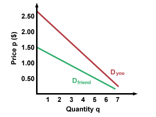
Many factors can affect demand quantity, including income, prices, and preferences. Let's look at one good to see how this works. How much are you willing to pay for a cold soda? If you recently got a raise at your job, you might not mind buying a pricier soda, even if you don't need it. Your friend who has less money, however, might pick a generic brand, or they might stick with tap water. Below are possible demand curves for you (with your big raise) and your friend (without no raise). Note that at every price you are willing to buy more soda than your friend is.
What if soda cost $1 yesterday and costs $2 today? That might make you think twice about getting the same soda you drank yesterday. Conversely, if it cost $2 yesterday and $1 today, you might be more willing to buy the soda than usual. We can see this on the graph on a single demand curve. When the price is $1, the quantity demanded is higher than when the price is $2.

We have been looking at how changes in price can affect buyers' decisions: when price increases, quantity demanded decreases, and vice versa. However, we have been assuming that everything else stays the same. This assumption allows us to use the same demand curve, with changes in price and quantity being represented by movements up and down the curve. This model of a buyer moving up and down along one demand curve is correct if the only thing that is changing is the price of the good. If income changes, however, the demand curve can actually shift.
For example, let's say that Conan's initial demand curve for concert tickets looks like curve \(D_1\) below. If Conan gets a new job, with a permanently higher income, his demand curve will likely shift outwards, to curve \(D_2\). Why is this? Conan realizes that he has more money and that, as long as he doesn't lose his new job, he will have more money in the foreseeable future. That enables him to buy more of what he likes. Price still matters to Conan, but at any price level, his quantity demanded is now higher than it was before the demand shift.

A demand shift can also occur with a change in buyer preferences. If Conan suddenly decides that he wants to collect jazz records (vinyl LPs, that is) and he now likes jazz records much more than he did before, his demand curve will shift outwards, reflecting his new appreciation of jazz, and his willingness to pay more for the same records, since they have become more valuable in his eyes.
To sum up: shifts in demand curves can be caused by changes in income (which make the goods seem more or less expensive) or changes in preferences (which make the goods seem more or less valuable).