Did you know you can highlight text to take a note?
x

Please wait while we process your payment
If you don't see it, please check your spam folder. Sometimes it can end up there.
If you don't see it, please check your spam folder. Sometimes it can end up there.
Please wait while we process your payment
Get instant, ad-free access to our grade-boosting study tools with a 7-day free trial!
Learn more

![]()

Create Account
This site is protected by reCAPTCHA and the Google Privacy Policy and Terms of Service apply.
Log into your PLUS account
Create Account
Select Plan
Payment Info
Start 7-Day Free Trial!
Select Your Plan
Monthly
$5.99
/month + tax
Annual
$29.99
/year + taxAnnual
2-49 accounts
$22.49/year + tax
50-99 accounts
$20.99/year + tax
Select Quantity
Price per seat
$29.99 $--.--
Subtotal
$-.--
Want 100 or more? Request a customized plan
Monthly
$5.99
/month + taxYou could save over 50%
by choosing an Annual Plan!

Annual
$29.99
/year + taxSAVE OVER 50%
compared to the monthly price!
| Focused-studying | ||
| PLUS Study Tools | ||
| AP® Test Prep PLUS | ||
| My PLUS Activity | ||
Annual
$22.49/month + tax
Save 25%
on 2-49 accounts
Annual
$20.99/month + tax
Save 30%
on 50-99 accounts
| Focused-studying | ||
| PLUS Study Tools | ||
| AP® Test Prep PLUS | ||
| My PLUS Activity | ||
Testimonials from SparkNotes Customers
No Fear provides access to Shakespeare for students who normally couldn’t (or wouldn’t) read his plays. It’s also a very useful tool when trying to explain Shakespeare’s wordplay!
Erika M.
I tutor high school students in a variety of subjects. Having access to the literature translations helps me to stay informed about the various assignments. Your summaries and translations are invaluable.
Kathy B.
Teaching Shakespeare to today's generation can be challenging. No Fear helps a ton with understanding the crux of the text.
Kay H.
Create Account
Select Plan
Payment Info
Start 7-Day Free Trial!
Payment Information
You will only be charged after the completion of the 7-day free trial.
If you cancel your account before the free trial is over, you will not be charged.
You will only be charged after the completion of the 7-day free trial. If you cancel your account before the free trial is over, you will not be charged.
Order Summary
Annual
7-day Free Trial
SparkNotes PLUS
$29.99 / year
Annual
Quantity
51
PLUS Group Discount
$29.99 $29.99 / seat
Tax
$0.00
SPARK25
-$1.25
25% Off
Total billed on Nov 7, 2024 after 7-day free trail
$29.99
Total billed
$0.00
Due Today
$0.00
Promo code
This is not a valid promo code
Card Details
By placing your order, you confirm that you have read the Privacy Policy and Kids’ Privacy Notice and agree to the Terms of Service.
By saving your payment information you allow SparkNotes to charge you for future payments in accordance with their terms.
Powered by stripe
Legal
Google pay.......

Thank You!
Your group members can use the joining link below to redeem their membership. They will be prompted to log into an existing account or to create a new account. All members under 16 will be required to obtain a parent's consent sent via link in an email.Your Child’s Free Trial Starts Now!
Thank you for completing the sign-up process. Your child’s SparkNotes PLUS login credentials are [email] and the associated password. If you have any questions, please visit our help center.Your Free Trial Starts Now!
Please wait while we process your payment
Sorry, you must enter a valid email address
By entering an email, I confirm that I or my legal guardian has read the Privacy Policy and Kids’ Privacy Notice and agrees to the Terms of Service.
Please wait while we process your payment
Sorry, you must enter a valid email address
By entering an email, I confirm that I or my legal guardian has read the Privacy Policy and Kids’ Privacy Notice and agrees to the Terms of Service.
Please wait while we process your payment
Your PLUS subscription has expired
Please wait while we process your payment
Please wait while we process your payment
Month
Day
Year
Please read our terms and privacy policy
Please wait while we process your payment
Histograms
A frequency distribution table is a table that shows how often a data point or a group of data points appears in a given data set. To make a frequency distribution table, first divide the numbers over which the data ranges into intervals of equal length. Then count how many data points fall into each interval.
If there are many values, it is sometimes useful to go through all the data points in order and make a tally mark in the interval that each point falls. Then all the tally marks can be counted to see how many data points fall into each interval. The "tally system" ensures that no points will be missed.
Example: The following is a list of prices (in dollars) of
birthday cards found in various drug stores:
| 1.45 | 2.20 | 0.75 | 1.23 | 1.25 |
| 1.25 | 3.09 | 1.99 | 2.00 | 0.78 |
| 1.32 | 2.25 | 3.15 | 3.85 | 0.52 |
| 0.99 | 1.38 | 1.75 | 1.22 | 1.75 |
| Intervals (in dollars) | Frequency |
| 0.50 - 0.99 | 4 |
| 1.00 - 1.49 | 7 |
| 1.50 - 1.99 | 3 |
| 2.00 - 2.49 | 3 |
| 2.50 - 2.99 | |
| 3.00 - 3.49 | 2 |
| 3.50 - 3.99 | 1 |
| Total | 20 |
A histogram is a bar graph which shows frequency distribution.
To make a histogram, follow these steps:
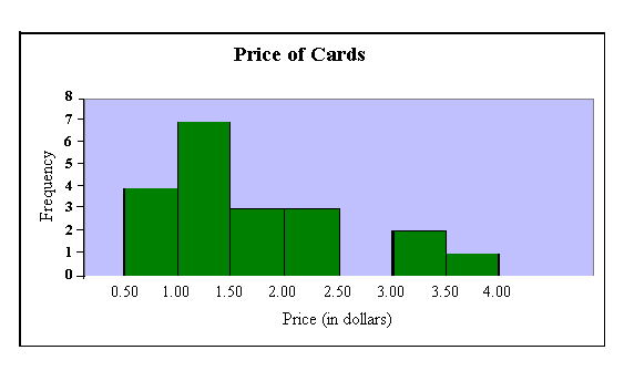
Histograms are useful because they allow us to glean certain information at a glance. The previous example shows that more birthday cards cost between $1.00 and $1.49 than any other price, because the bar which corresponds to those values is highest. We can also see that twice as many cards cost between $3.00 - $3.49 as cost between $3.50 - $3.99, because the bar which corresponds to $3.00 - $3.49 is twice as high as the bar which corresponds to $3.50 - $3.99.
Please wait while we process your payment