


Defining and Measuring Income Distribution
Income distribution is the smoothness or equality with which income is dealt out among members of a society. If everyone earns exactly the same amount of money, then the income distribution is perfectly equal. If no one earns any money except for one person, who earns all of the money, then the income distribution is perfectly unequal. Usually, however, a society's income distribution falls somewhere in the middle between equal and unequal.
How do we measure this degree of equality or inequality? Economists often measure income equality by measuring how much income is earned by different segments of the population. For instance, if we break down all workers into five segments in terms of how much money they make: the top 20%, the second 20%, the third 20%, the fourth 20%, and the bottom 20%, and we obtain data on how much money they make, we can then create a chart detailing how much income each segment earns out of the total amount of income for all workers. The bigger the difference between the different segments, the greater the income inequality.
Let's say that the average incomes for five segments in a society are $10,000, $24,000, $50,000, $80,000, and $110,000. In order to look at income distribution, we need to see what percentage of total income each segment makes, rather than the actual amount of money each makes. Since each of the segments is equal in size, we don't need to worry about weighting the average incomes, and can do a straightforward part-over-whole calculation of each segment's earnings.
For total income we will use the sum of the five average incomes:
Total Income = 10000 + 24000 + 50000 + 80000 + 110000Next we find the percentage of total income that each segment of the population earns, by dividing their income by the total income:
Total Income = 274000
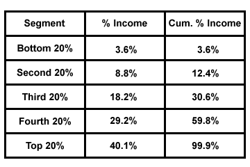
Bottom segment percentage = 10000/274000 = 0.036 = 3.6%What these figures indicate is that the bottom fifth of the population gets less than 4% of the total income, while the top fifth of the population gets over 40% of the total income, indicating a large degree of income inequality.
Second segment percentage = 24000/274000 = 0.088 = 8.8%
Third segment percentage = 50000/274000 = 0.182 = 18.2%
Fourth segment percentage = 80000/274000 = 0.292 = 29.2%
Top segment percentage = 110000/274000 = 0.401 = 40.1%
Economists also look at cumulative figures for income distribution. To do this, simply add the percentages together at each level, giving the amount of income earned by all people at or below a certain level. In our example, it would work as follows:
Bottom segment cumulative percentage = 3.6%Note that the total cumulative percentage, which should be equal to 100%, since it represents the total income earned by all workers, is only 99.9%. This sometimes happens due to rounding of numbers.
Second segment cumulative percentage = 3.6% + 8.8% = 12.4%
Third segment cumulative percentage = 12.4% + 18.2% = 30.6%
Fourth segment cumulative percentage = 30.6% + 29.2% = 59.8%
Top segment cumulative percentage = 59.8% + 40.1% = 99.9%
These two figures, percentage and cumulative percentage, are usually placed in a
table for easier reading:
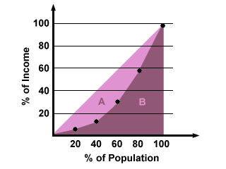
Lorenz Curves and Gini Coefficients
While the data of percentage and cumulative percentage can provide a rough idea
of how equal or unequal income distribution is, sometimes it is easier to see
how they line up on a graph, so that we can get a visual sense of income
equality. To do this, plot out how much each of the population segments earns
(cumulatively), and compare the resulting curve to a perfectly equal income
distribution, which would be a straight-line graph:
Income Mobility
Another factor to consider when studying the degree of inequality in a society is the amount of income mobility. Income mobility refers to the ease with which workers can move up and down in the hierarchy of earning power. If the rich always stay rich and the poor always stay poor, then an unequal income distribution is a permanent and serious problem. If workers easily shift from middle class to upper class or from lower class to middle class, however, then the degree of inequality becomes less serious, since the inequality is fluid and temporary (on an individual basis).