Did you know you can highlight text to take a note?
x

Please wait while we process your payment
If you don't see it, please check your spam folder. Sometimes it can end up there.
If you don't see it, please check your spam folder. Sometimes it can end up there.
Please wait while we process your payment
Get instant, ad-free access to our grade-boosting study tools with a 7-day free trial!
Learn more

![]()
Create Account
Select Plan
Payment Info
Start 7-Day Free Trial!
Create Account
This site is protected by reCAPTCHA and the Google Privacy Policy and Terms of Service apply.
Log into your PLUS account
Create Account
Select Plan
Payment Info
Start 7-Day Free Trial!
Select Your Plan
Monthly
$5.99
/month + tax
Annual
$29.99
/year + taxAnnual
2-49 accounts
$22.49/year + tax
50-99 accounts
$20.99/year + tax
Select Quantity
Price per seat
$29.99 $--.--
Subtotal
$-.--
Want 100 or more? Request a customized plan
Monthly
$5.99
/month + taxYou could save over 50%
by choosing an Annual Plan!

Annual
$29.99
/year + taxSAVE OVER 50%
compared to the monthly price!
| Focused-studying | ||
| PLUS Study Tools | ||
| AP® Test Prep PLUS | ||
| My PLUS Activity | ||
Annual
$22.49/month + tax
Save 25%
on 2-49 accounts
Annual
$20.99/month + tax
Save 30%
on 50-99 accounts
| Focused-studying | ||
| PLUS Study Tools | ||
| AP® Test Prep PLUS | ||
| My PLUS Activity | ||
Testimonials from SparkNotes Customers
No Fear provides access to Shakespeare for students who normally couldn’t (or wouldn’t) read his plays. It’s also a very useful tool when trying to explain Shakespeare’s wordplay!
Erika M.
I tutor high school students in a variety of subjects. Having access to the literature translations helps me to stay informed about the various assignments. Your summaries and translations are invaluable.
Kathy B.
Teaching Shakespeare to today's generation can be challenging. No Fear helps a ton with understanding the crux of the text.
Kay H.
Create Account
Select Plan
Payment Info
Start 7-Day Free Trial!
Payment Information
You will only be charged after the completion of the 7-day free trial.
If you cancel your account before the free trial is over, you will not be charged.
You will only be charged after the completion of the 7-day free trial. If you cancel your account before the free trial is over, you will not be charged.
Order Summary
Annual
7-day Free Trial
SparkNotes PLUS
$29.99 / year
Annual
Quantity
51
PLUS Group Discount
$29.99 $29.99 / seat
Tax
$0.00
SPARK25
-$1.25
25% Off
Total billed on Nov 7, 2024 after 7-day free trail
$29.99
Total billed
$0.00
Due Today
$0.00
Promo code
This is not a valid promo code
Card Details
By placing your order, you confirm that you have read the Privacy Policy and Kids’ Privacy Notice and agree to the Terms of Service.
By saving your payment information you allow SparkNotes to charge you for future payments in accordance with their terms.
Powered by stripe
Legal
Google pay.......

Thank You!
Your group members can use the joining link below to redeem their membership. They will be prompted to log into an existing account or to create a new account. All members under 16 will be required to obtain a parent's consent sent via link in an email.Your Child’s Free Trial Starts Now!
Thank you for completing the sign-up process. Your child’s SparkNotes PLUS login credentials are [email] and the associated password. If you have any questions, please visit our help center.Your Free Trial Starts Now!
Please wait while we process your payment
Sorry, you must enter a valid email address
By entering an email, I confirm that I or my legal guardian has read the Privacy Policy and Kids’ Privacy Notice and agrees to the Terms of Service.
Please wait while we process your payment
Sorry, you must enter a valid email address
By entering an email, I confirm that I or my legal guardian has read the Privacy Policy and Kids’ Privacy Notice and agrees to the Terms of Service.
Please wait while we process your payment
Your PLUS subscription has expired
Please wait while we process your payment
Please wait while we process your payment
Month
Day
Year
Please read our terms and privacy policy
Please wait while we process your payment
Two Approaches to Demand
Economists graphically represent the relationship between product price and quantity demanded with a demand curve. Typically, demand curves are downwards sloping, because as price increases, buyers are less likely to be willing or able to purchase whatever is being sold. Each individual buyer can have their own demand curve, showing how many products they are willing to purchase at any given price, as shown below. This graph shows what Jim's demand curve for graham crackers might be:
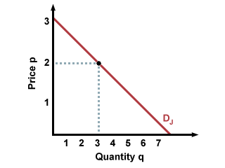
To find out how many boxes of graham crackers Jim will buy for a given price, extend a perpendicular line from the price on the y-axis to his demand curve. At the point of intersection, extend a line from the demand curve to the x-axis (perpendicular to the x-axis). Where it intersects the x-axis (quantity) is how many boxes of graham crackers Jim will buy. For instance, in the graph above, Jim will buy 3 boxes when the price is $2 a box.
Typically, economists don't look at individual demand curves, which can vary from person to person. Instead, they look at aggregate demand, the combined quantities demanded of all potential buyers. To do this, add the quantities which buyers are willing to buy at different prices. For instance, if Jim and Marvin are the only two buyers in the market for graham crackers, we would add how many they are willing to buy at price p=1 and record that as aggregate demand for p=1. Then we would add how many they are willing to buy at price p=2 and record that as aggregate demand for p=2, and so on. This results in the following graph of aggregate demand for graham crackers:
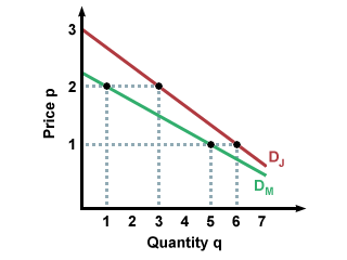
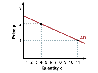
This method is called horizontal addition because you look at a price level, and add the separate quantities demanded across that price level, giving you total quantity demanded for that price.
There are many factors that can affect demand quantity, including income, prices, and preferences. Let's look at one good to see how this works. How much are you willing to pay for a cold soda? If you recently got a raise at your job, you might not mind buying a pricier soda, even if you don't need it. Your friend who has less money, however, might pick a generic brand, or they might stick with tap water. Below are possible demand curves for you (with your big raise) and your friend (without your big raise). Note that you are willing to buy more soda than your friend is:
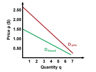
What if soda cost a dollar yesterday and costs two dollars today? That might make you think twice about getting the same soda you drank yesterday. Likewise, if it cost two dollars yesterday and a dollar today, you might be more willing to buy the soda than usual. We can see this on the graph on a single demand curve. When the price is a dollar, the quantity demanded is higher than when the price is two dollars. What this means in the real world is that if two companies charge different prices for the same good, the company that charges a lower price will get more customers. (Exceptions to this general rule may occur when there is a real or perceived difference in quality of the goods being sold).
Please wait while we process your payment