


Utility and Indifference Curves
We know how to represent changes in demand as price or income changes on a graph, but how can we show preferences? What makes buyers happy and how can we measure that happiness? Economists use the term utility when referring to the level of happiness or satisfaction that someone experiences from buying (or selling) goods and services: the more utility, the happier the person. Utility is typically represented on a graph in an indifference curve. An indifference curve represents all of the different combinations of two goods that generate the same level of utility. What this means is that each point on an indifference curve represents a combination of goods. All points on one indifference curve give the person the exact same amount of happiness. For instance, if you give Jim a choice between points A and B on this indifference curve, he won't really mind either way, he is indifferent. One shirt and two hats makes him just as happy as two shirts and one hat, which is why both points are on the same indifference curve.
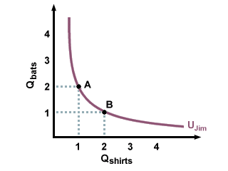
One of Jim's Indifference Curves for Shirts and Hats
In general, indifference curves bow in towards the origin, rather than being straight lines or outward-bulging curves. The reason for this is that most people do not like extremes: they would rather have a some shirts and some hats than many hats and no shirts. This changing preference results in the traditional inward-curving indifference curves, and illustrates the effects of diminishing returns. In this example, diminishing returns simply means that the first hat Jim gets makes him happier than the second hat, which makes him happier than the third, and so on. His marginal utility--the extra utility he gets with each hat--decreases with the number of hats he gets. After a while, he has had enough of hats, the extra ones don't make him much happier, and he'd rather get a shirt, and might even trade several hats for one shirt. Generally, at the extremes, people are willing to give up many hats to get a few shirts; as the numbers even out, this swapping ratio decreases, and then when they start moving to the other extreme, they want a lot of shirts in exchange for any hats they might give up.
Another example that illustrates the principle of diminishing returns would be the case in which you give Thom a choice between gold and steak. We all know that a bar of gold is worth more than a steak, so only a fool would choose the steak over the gold, right? Thom knows this. If you ask Thom to choose between a bar of gold and a steak, he will probably choose the gold, and be very excited to have a bar of gold. The marginal utility of that first bar of gold is quite high. An hour later, he will choose another bar of gold, and he will still be happy to get another bar of gold; the marginal utility he gets from the second bar of gold might not be quite as high as the marginal utility from the first bar, but it's still higher than the marginal utility he would get from a steak. This will continue, bar after bar, with the added utility of each bar of gold being a little lower than the last. Eventually, Thom will start to get hungry, and if he gets hungry enough, then he will choose the steak over the gold, as the marginal utility from the steak will be higher than the marginal utility from a bar of gold. Thom still knows the relative values of gold and steak, and he knows that he is choosing something that is worth less, but in his situation, he has so much gold that more gold makes very little difference, but a steak can make a large difference, as he is very hungry.
Different indifference curves represent different levels of utility, and in general, more is better: the more goods you have, the happier you are. On the graph, we see this preference for more as an indifference curve that is further away from the origin. Thus, because curve 2 is further out than curve 1, and represents a higher level of utility, any point on curve 2 will be preferable to any point on curve 1, and any point on curve 3 will be preferable to any point on curves 1 or 2.
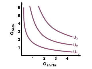
Indifference Curves
A few more important observations about one person's indifference curves: they can never cross. Why is this true? Think about it this way: if curve 2 is supposed to make you happier than curve 1, but curve two crosses curve 1, then that means that at the point of intersection, you are experiencing two different levels of utility, that is, you are both happy and happier at the same time, which makes no sense. Thus, indifference curves never intersect, but move further away from the origin with increased levels of utility.
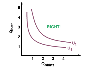
A Correct Set of Indifference Curves

An Incorrect Set of Indifference Curves
The indifference curves we have been considering are for normal goods. How can we tell? Because more of either good increases utility. Starting on curve 1 and moving outwards (increasing the number of hats) or upwards (increasing the number of shirts) lands us on curve 2, representing a higher level of utility. Using different types of goods changes what indifference curves look like.